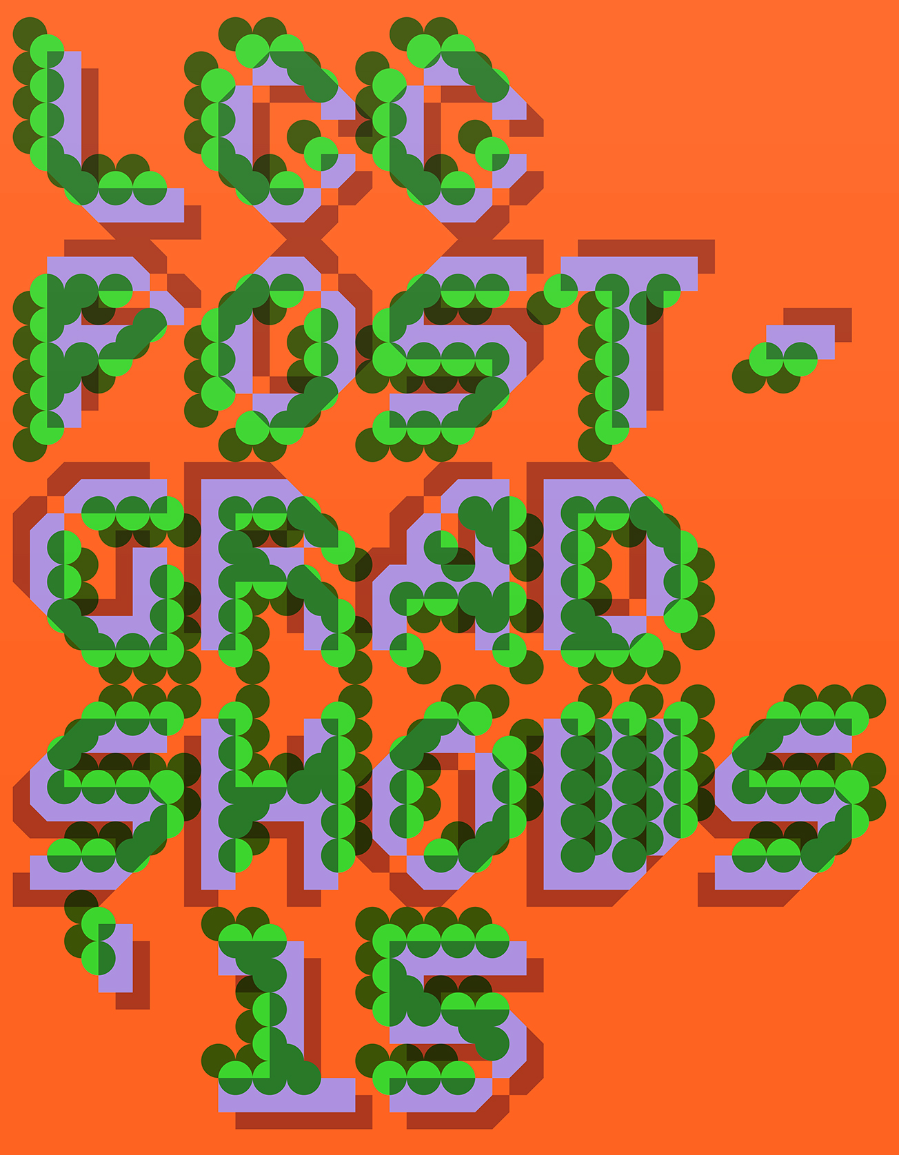
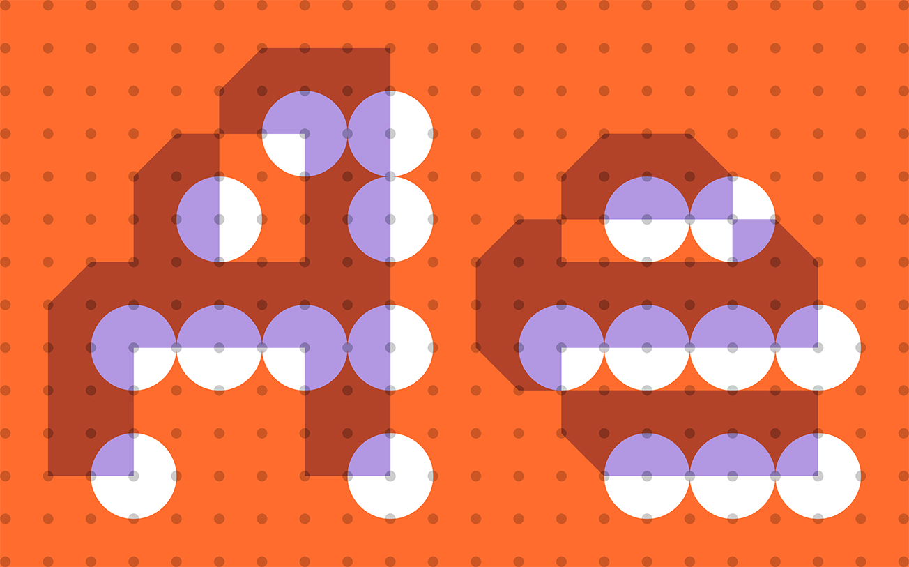
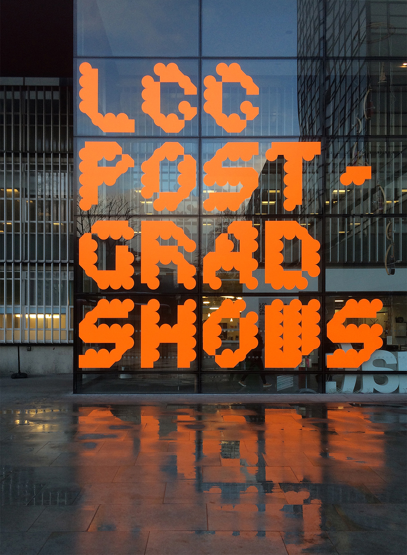
The core of the London College of Communication Postgraduate Shows identity is built using two fonts from a set of custom modular typefaces MuirMcNeil developed for the
LCC Summer Shows. The two fonts are overlaid and offset by the same interval in four directions (up/left; down/left; down/right; up/right); in the same colour for external signage and animated graphics, and in overprinted colours on literature. The four offsets create distortion through a change in diagonal stress within the four-line Shows title block, and through movement in animated form.