MuirMcNeil FourPoint is an optical/geometric typeface designed as playful response to the simple everyday lettering that is commonly seen on LED displays in transportation signage: on trains and road networks. It is also an investigation into the use of predefined conditions to progressively modify forms. In FourPoint, like other MuirMcNeil typefaces, individual letters operate as variable components within differential systems. FourPoint is designed in four scaleable groups of five weights each.
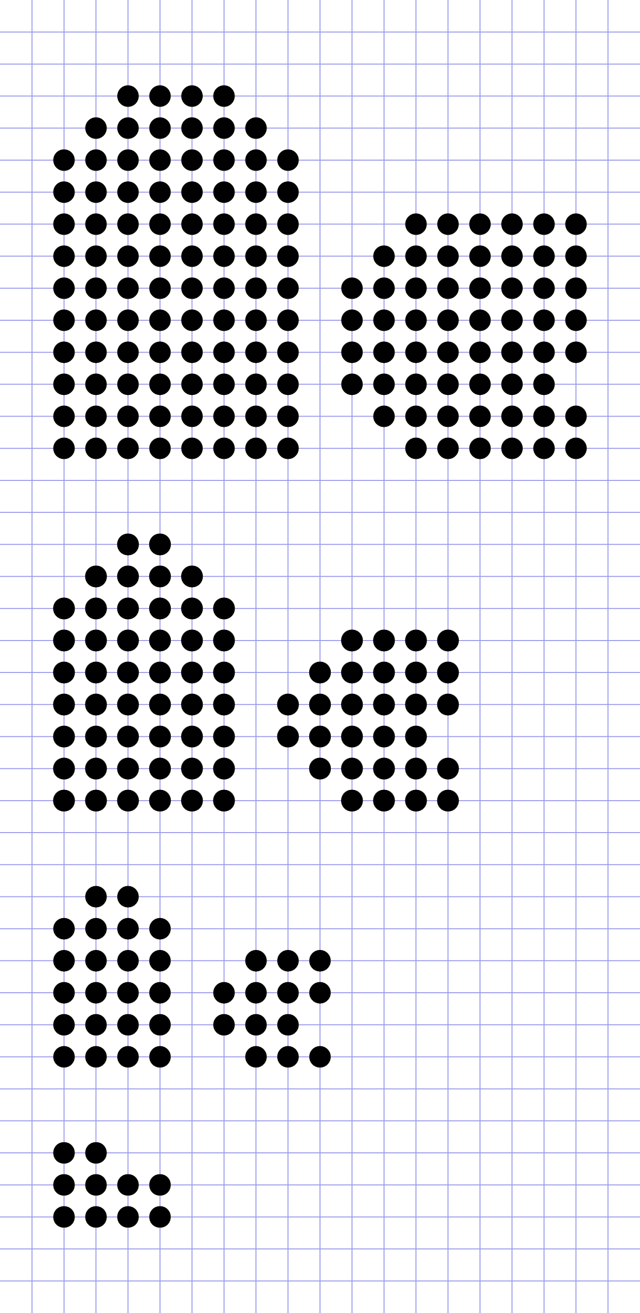
FourPoint explores two specific typographic conditions: resolution — the proportionate relationship between scale and visual information; and weight — the proportionate relationship between filled and void parts of letters and word forms. It has been constructed on a fixed grid at four resolutions. FourPoint 04 has a consistent stroke width of four dots; FourPoint 03, a stroke of three dots; FourPoint 02, a stroke of two dots and FourPoint 01, a stroke of one dot. The body of every letter in each typeface group scales to the proportions of the stroke widths with the one dot variant teetering at the edge of the lowest resolution and the limit of legibility.
In each scale group, the grid determines character outlines and their positions, including letter spacing, word spacing, side-bearings and kerning values. Every dot aligns consistently on the same grid and weight is incremented without changing any positions. Instead, the diameters of individual dots within each letter enlarge progressively rather than thinning or thickening the stroke width. Where traditional type design only allows a binary contrast of black and white, positive and negative, form and counterform, FourPoint typefaces subvert this limitation by imitating half-tone dot screens to give the illusion of tints within the bodies of the letters. Each FourPoint group is available in five densities from Light to Fat.
The five weights or tonal densities in each scale group are identified both by name and numerically. The number codes describe dot diameters in units as fractions of the 1000 unit Postscript em square. ‘FourPoint 02 080 Regular’, for example, indicates stroke width (2 dots) and dot diameter (80/1000 units). As a result, size and weight ratios can be accurately calculated in setting typographic compositions.
FourPointcis available in Latin glyph encoding in OpenType and Web font formats.