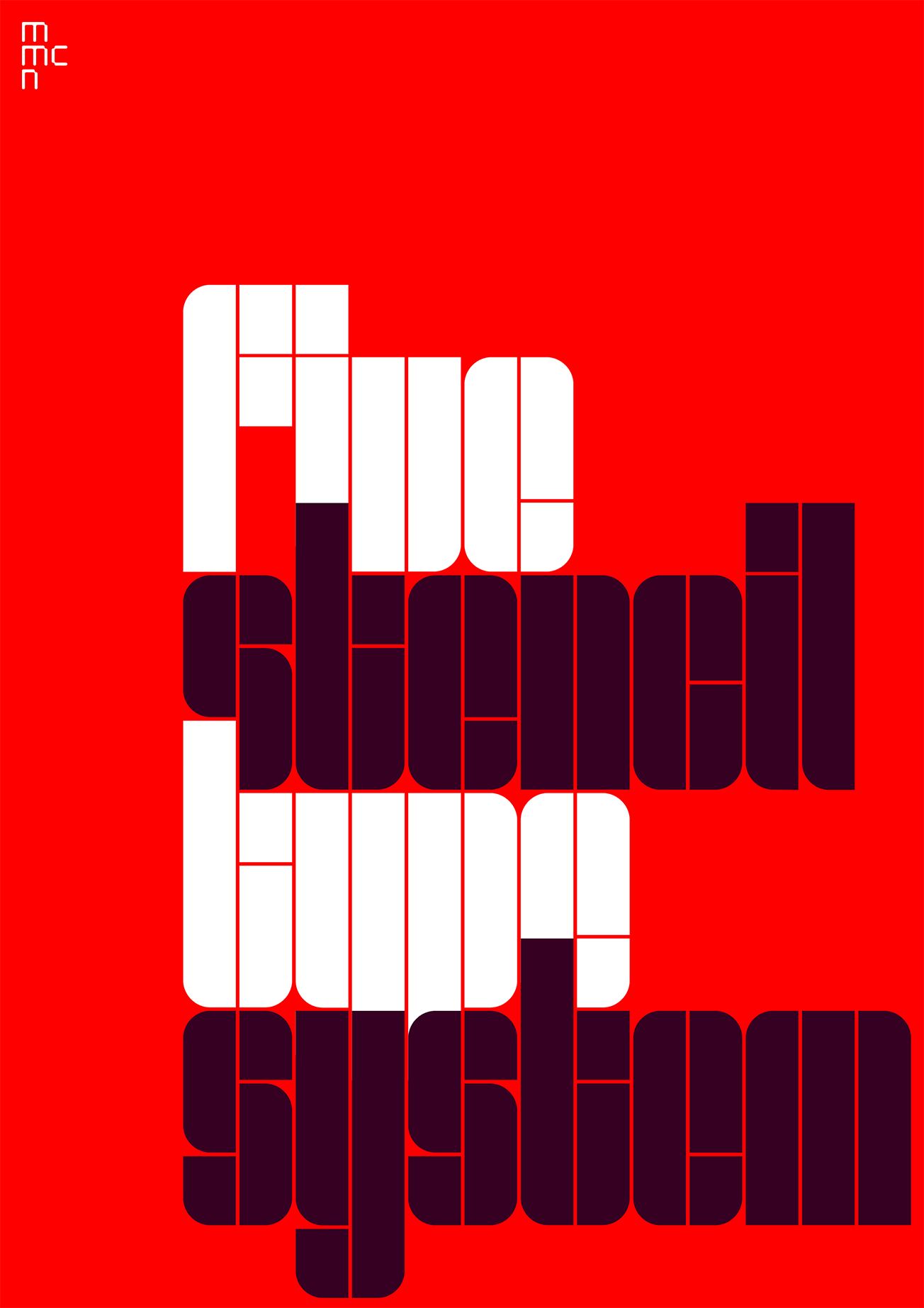
The Five system is one of a series of stencil type families first published by MuirMcNeil in 2017. It was extensively revised and republished in 2021 in three different contours, each in two widths, two optical weights and in positive and negative versions.
Constructed from basic geometric segments, Five is intended to explore relationships between figure and ground. Instead of assembling glyphs from a minimal set of strokes in the conventional manner, Five has been built around a system of internal spaces that are reduced to thin white lines, resulting in dense and imposing alphabets.
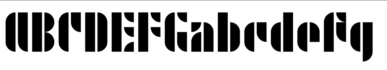
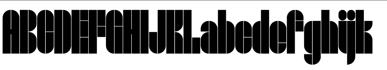
The stencil contours and void spaces of the Five typefaces reference designs such Kombinations-Schrift, drawn by Josef Albers’ in 1921, along with compressed rectilinear sans serifs from the 1960s such as Letraset’s Compacta and Walter Haettenschweiler’s Schmalfette Grotesk from 1954. In MuirMcNeil Five the lower case, from baseline to x-height, divides into either two or three horizontal sections. Following principles similar to those used by Walter Ballmer in 1971 for his Olivetti logo and lettering designs, this allows stroke proportions to be modulated more fluently and more naturally than is common in constructed types.