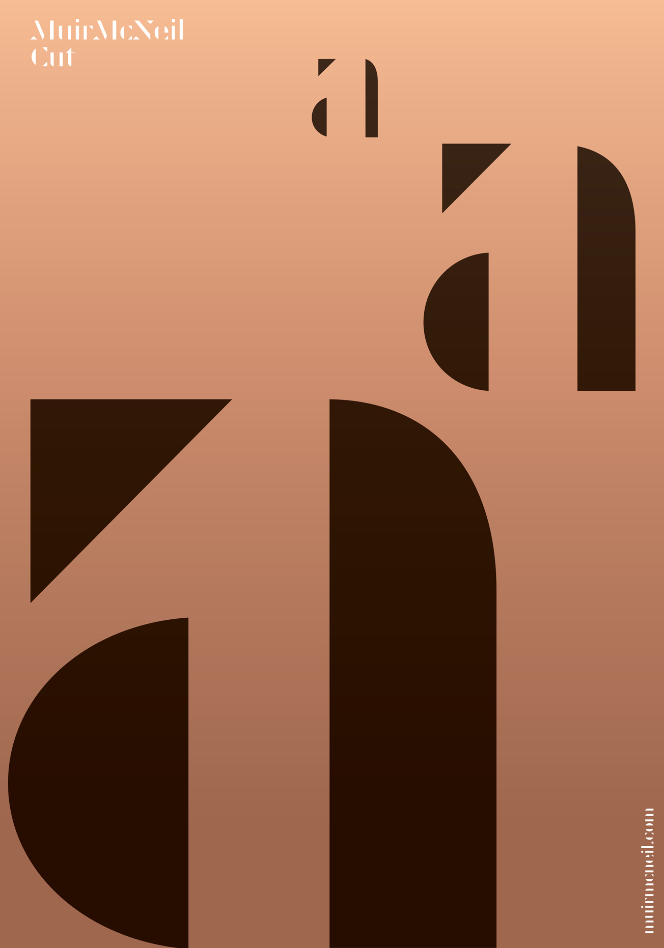
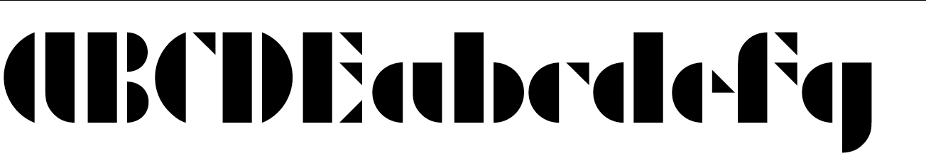
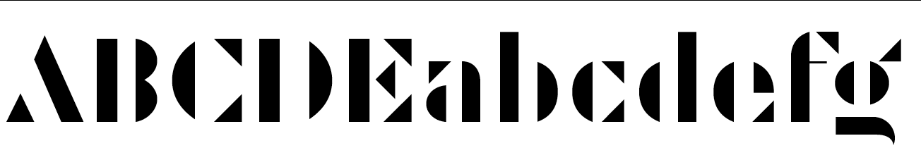
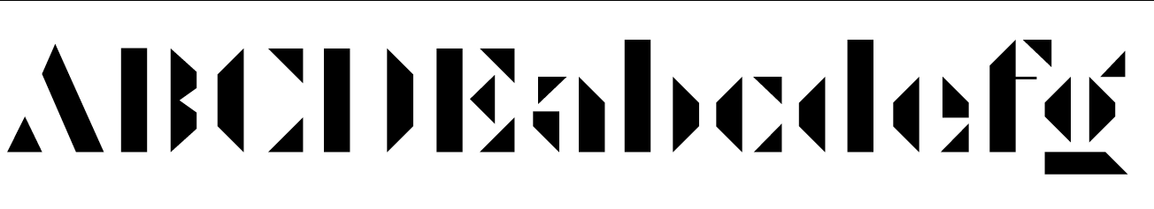
The systematic construction methods used to assemble Cut’s letters references typefaces created in the early twentieth century where parts of letters were reduced to simple geometric units that could be used as structural components to build alphabets, using scaling, reflection, repetition and redistribution.
Although the typefaces produced in these historical periods appear to share few visual attributes, they can be seen as stages in the development of a common heritage that is rational, reductive, elegant and modern. The MuirMcNeil Cut type system is intended to reconcile these disparate points of historical reference.
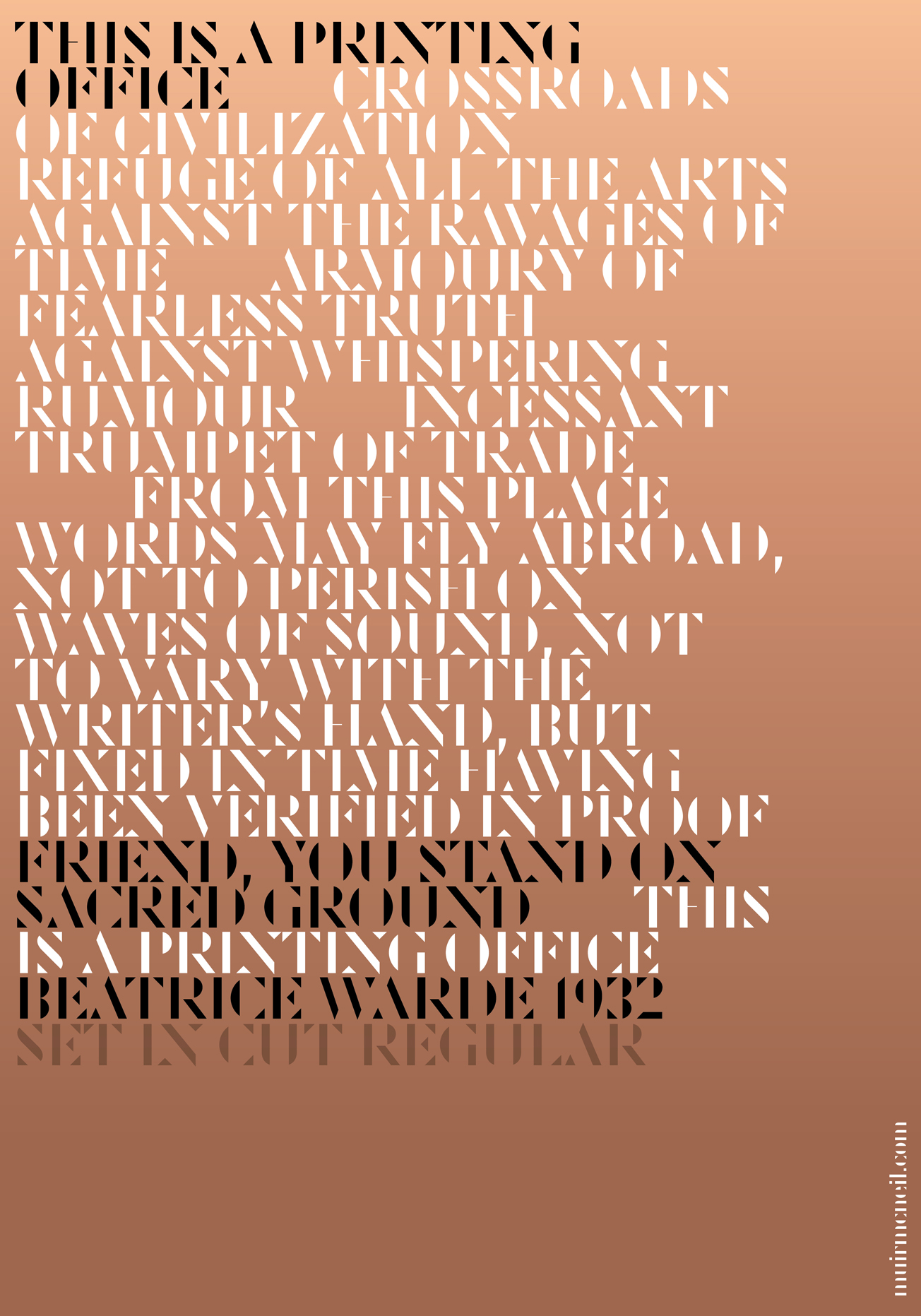
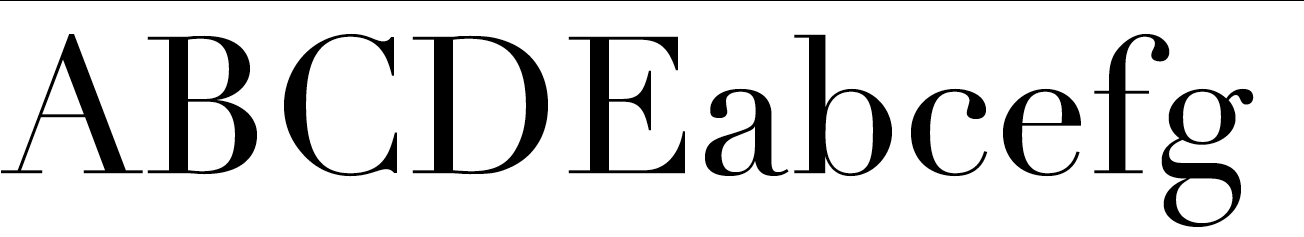
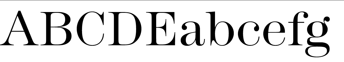
Cut and Cut Square are available in both OpenType and Web font formats, each in Light, Regular and Bold weights.